3次元なのでmpl_toolkits.mplot3dをインポートします。ソースコードと実行例を示します。
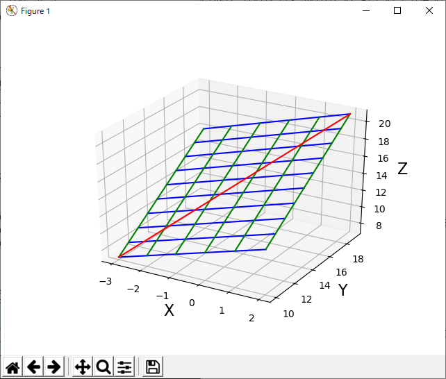
Z=X*Y が成り立つ図形のプロットです。Zが縦軸になっています。
from mpl_toolkits.mplot3d import Axes3D
import matplotlib.pyplot as plt
import numpy as np

x = np.arange(-3, 3, 1.0)
print("x=",x)
'''
x= [-3. -2. -1.  0.  1.  2.]
'''
y = np.arange(10, 20, 1.0)
print("y=",y)
'''
y= [ 10.  11.  12.  13.  14.  15.  16.  17.  18.  19.]
'''
# z=f(x,y)のnumpy算術がプロット順にするための配列生成
X, Y = np.meshgrid(x, y)
print("X=",X)
'''
X= [[-3. -2. -1.  0.  1.  2.]
 [-3. -2. -1.  0.  1.  2.]
 [-3. -2. -1.  0.  1.  2.]
 [-3. -2. -1.  0.  1.  2.]
 [-3. -2. -1.  0.  1.  2.]
 [-3. -2. -1.  0.  1.  2.]
 [-3. -2. -1.  0.  1.  2.]
 [-3. -2. -1.  0.  1.  2.]
 [-3. -2. -1.  0.  1.  2.]
 [-3. -2. -1.  0.  1.  2.]]
'''
print("Y=",Y)
'''
Y= [[ 10.  10.  10.  10.  10.  10.]
 [ 11.  11.  11.  11.  11.  11.]
 [ 12.  12.  12.  12.  12.  12.]
 [ 13.  13.  13.  13.  13.  13.]
 [ 14.  14.  14.  14.  14.  14.]
 [ 15.  15.  15.  15.  15.  15.]
 [ 16.  16.  16.  16.  16.  16.]
 [ 17.  17.  17.  17.  17.  17.]
 [ 18.  18.  18.  18.  18.  18.]
 [ 19.  19.  19.  19.  19.  19.]]
'''
Z = X + Y       # 個々Z軸を一括演算
print("Z=",Z)
'''
Z= [[  7.   8.   9.  10.  11.  12.]
 [  8.   9.  10.  11.  12.  13.]
 [  9.  10.  11.  12.  13.  14.]
 [ 10.  11.  12.  13.  14.  15.]
 [ 11.  12.  13.  14.  15.  16.]
 [ 12.  13.  14.  15.  16.  17.]
 [ 13.  14.  15.  16.  17.  18.]
 [ 14.  15.  16.  17.  18.  19.]
 [ 15.  16.  17.  18.  19.  20.]
 [ 16.  17.  18.  19.  20.  21.]]
'''

fig = plt.figure() # 2次元の図を初期化「1つのshow()ごとで必要」
ax = Axes3D(fig) # 3次元版に変換「1つのshow()ごとで必要」

# プロットする。(主要なプロットを3つ紹介)
ax.plot_wireframe(X,Y,Z) #ワイヤーフレームのプロット
#ax.plot_surface(X, Y, Z, rstride=1, cstride=1)#サーフェスのプロット
#ax.scatter3D(np.ravel(X),np.ravel(Y),np.ravel(Z))#点のプロット

plt.show() #表示
上記では、plt.show() をすぐに実行させないで、以下を追加して線を追加描画しています。
def plot_xyz_to_xyz(x1,y1,z1,  x2,y2,z3 , color="red"):
   X = np.array( [ [x1, x2] ])
   Y = np.array( [ [y1, y2] ])
   Z = np.array( [ [z1, z2] ])
   ax.plot_wireframe(X,Y,Z, color=color) #ワイヤーフレームのプロット

x1,y1,z1,  x2,y2,z2 = (-3, 10 , 7,   2, 19,  21)
plot_xyz_to_xyz( x1,y1,z1,  x2,y2,z2 ) # 線をプロットする。

# 矢印をプロットする。
px, py, pz = (
   np.array([[-3]]),
   np.array([[10]]),
   np.array([[ 7]]) )

u, v, w = (
   np.array([[ 0 ]]),
   np.array([[ 0 ]]),
   np.array([[ 1 ]]) )

ax.quiver(px, py, pz, u, v, w, length=5, normalize=True, color="green") # 矢印プロット

plt.show() #表示
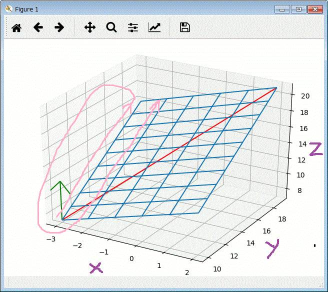
上記グラフで、ピンクの矢印がZ内のデータが並ぶ順番です。
また、手書きで、X,Y,Zの軸のラベルを書きましたが、以下の表現をshow()の前に記述すれば
描いてくれます。
ax.set_xlabel("X", size = 16) # 軸ラベルを設定
ax.set_ylabel("Y", size = 16)
ax.set_zlabel("Z", size = 16)
次の関数の例で示します。 y = x0**2 + x1**2 の関数を使います。これをプロットするコードは次のようになります。
def func_X2(x0,x1):
   return x0**2 + x1**2

from mpl_toolkits.mplot3d import Axes3D
import matplotlib.pyplot as plt
import numpy as np

x_0 = np.arange(-4, 4, 0.5)
#print("x_0=",x_0)

x_1 = np.arange(-4, 4, 0.5)
#print("x_1=",x_1)

# y=f(x_0,y_1)のnumpy算術がプロット順にするための配列生成
X0, X1 = np.meshgrid(x_0, x_1)
#print("X0=",X0)
#print("X1=",X1)

Y =func_X2(X0,X1)       # 個々Z軸を一括演算
print("Y=",Y)

fig = plt.figure() # 2次元の図を初期化「1つshow()の前に必要」
ax = Axes3D(fig) # 3次元版に変換「1つshow()の前に必要」

ax.plot_wireframe(X0,X1,Y) #ワイヤーフレームのプロット

plt.show() #表示

複数の変数からなる関数の微分を偏微分と言います。
上記 y = x0**2 + x1**2 であれば、
x0,x1の2つ(複数)の変数を使っていますが、このこような時に使います。
この例「x0,x1の2つの変数」の偏微分の式は、δf/δx0 、δf/δx1 のように書きます。(δ :デルタと呼んでます)
偏微分は、1つ変数の微分と同じで、ある所の傾きと言えます。
ただし、変数がたくさんあるので、1つの変数に絞って(他の変数を固定して)、算出する考え方です。
上記の微分で作ったnumerical_diff_sp関数を使って、算出した例です。
一方の変数を固定にするためにfunc_X2を、x1を固定にしてx0を引数にするfunc0と、x0を固定にしてx1を引数にするfunc1とに分けて
計算させた例です。
def numerical_diff_sp(f,x): # 関数f で xの微分値を求める
   h = 1e-4
   return (f(x+h)- f(x-h))/(2*h)

def func0(x0): # y=x0**2+x1**2 の式で、x1=を4.0に固定して、x0のδf/δx0 を求めるための関数を定義
   return x0**2 + 4.0**2

y=numerical_diff_sp(func0,3.0) # x1=を4.0に固定して、x0が3.0 のδf/δx0 を求める。
print(y) # 結果:6.00000000000378


def func1(x1): # y=x0**2+x1**2 の式で、x0=を3.0に固定して、x0のδf/δx1 を求めるの関数を定義
   return 3**2 + x1**2

y=numerical_diff_sp(func1,4.0) # x1=を3.0に固定して、x0が4.0 のδf/δx1 を求める。
print(y) # 結果:7.999999999999119
上記では「y=x0**2+x1**2」の関数を「func0」と「func1」に分けて、 x0=3.0,x1=4.0の δf/δx0 、δf/δx1を求めました。
将来的にxの入力が、たくさんあっても可能なように、x0,x1・・・ を np.arrayで扱えるように一般化したコードを示します。
よって以下では、「y=x0**2+x1**2」をfunction_2で定義しなおして、計算して前述の同じ結果にあることを検証しています。
import numpy as np
def function_2(x):
   return np.sum(x**2)   # x[0]**2 + x[1]**2 と同じ

def numerical_gradient_d1(f, x): # 1次元の配列で変数を指定し、その時の勾配を求める。(偏微分の値を求める。)
    h = 1e-4 # 0.0001
    grad = np.zeros_like(x)

    for idx in range(x.size):
        tmp_val = x[idx]
        x[idx] = float(tmp_val) + h
        fxh1 = f(x) # f(x+h)

        x[idx] = tmp_val - h
        fxh2 = f(x) # f(x-h)
        grad[idx] = (fxh1 - fxh2) / (2*h)

        x[idx] = tmp_val # 値を元に戻す

    return grad

x = np.array([ 3.0,4.0 ])
y = numerical_gradient_d1( function_2, x ) # numerical_diff_spで行った実行結果と同じ結果が得られる。

print(y[0], ",", y[1]) # 出力:6.0 , 8.0
x = np.array([ 3.0, 0.0 ])
y = numerical_gradient_d1( function_2, x )
print(y[0], ",", y[1]) # 出力:6.00000000001 , 0.0
x = np.array([ -3.0 , -2.0 ])
y = numerical_gradient_d1( function_2, x)
print(y[0], ",", y[1]) # 出力:-6.00000000001 , -4.0
上記に続けて、下記コードを、上記の3次元プロットののコードに追加すると
赤の矢印が得られます。
これは、 x0=-3.0, x1=-2.0 の勾配を示す矢印です。
# 矢印をプロットする。
px, py, pz = (
   np.array([[x[0]]]),
   np.array([[x[1]]]),
   np.array([[function_2(x)]]) )

import math
u, v, w = (
   np.array([[ 1 ]]),
   np.array([[ 1 ]]),
   np.array([[ -math.sqrt(y[0]**2 + y[1]**2) ]]) )

ax.quiver(px, py, pz, u, v, w, length=-5, normalize=True, color="red") # 矢印プロット
plt.show() #表示
たくさん個所の勾配から、偏微分を解く考え方を考える。
たくさん個所をの勾配を求めるので、2次元配列も指定する関数を作ります。
numerical_gradient_d1を利用したnumerical_gradient_d2を作りました。それに伴い、
function_2も変更しています。
以下に、複数の勾配を2次元化した例を含みコードと結果を示します。
import numpy as np

def numerical_gradient_d2(f, X): # 1次元、2次元入力の兼用で配列で変数を指定し、その時の勾配を求める。
    if X.ndim == 1:
        return numerical_gradient_d1(f, X) # 1元の場合
    else:
        grad = np.zeros_like(X)
        for idx, x in enumerate(X):
            grad[idx] = numerical_gradient_d1(f, x)
        return grad

def function_2_sp(x):  # 1次元、2次元入力の兼用で配列で変数を指定し、# x[0]**2 + x[1]**2を求める関数。
    if x.ndim == 1:
        return np.sum(x**2) # 1次元
    else:
        return np.sum(x**2, axis=1) # 2次元

x=np.array([ 3.0, 4.0 ]) # 1次元入力の検証
numerical_gradient_d2(function_2_sp, x ) # 出力結果: array([ 6.,  8.])

x0=np.array([ 3.0, 3.0, -3.0 ])
x1=np.array([ 4.0, 0.0, -2.0 ])
grad = numerical_gradient_d2(function_2_sp, np.array([x0, x1]) ) # 2次元入力の検証
grad # 次の出力結果となり、検証できた。
array([[ 6.,  6., -6.],
       [ 8.,  0., -4.]])
上記の
numerical_gradient_d2を使ってもできますが、そうするために
以前に定義したfunction_2を、対応する専用の
function_2_spに変更する必要がありました。
そこで以前に作成した、本来の
function_2で動作可能なnumerical_gradientに改造します。
そして、この関数を使って、たくさんの点を勾配を視覚可した例を示します。
import numpy as np

def numerical_gradient(f, x):
    h = 1e-4 # 0.0001
    grad = np.zeros_like(x)

    it = np.nditer(x, flags=['multi_index'], op_flags=['readwrite'])
    while not it.finished:
        idx = it.multi_index
        tmp_val = x[idx]
        x[idx] = float(tmp_val) + h
        fxh1 = f(x) # f(x+h)

        x[idx] = tmp_val - h
        fxh2 = f(x) # f(x-h)
        grad[idx] = (fxh1 - fxh2) / (2*h)

        x[idx] = tmp_val # 値を元に戻す
        it.iternext()

    return grad

def function_2(x): # 以前の関数に戻す。
   return np.sum(x**2)   # x[0]**2 + x[1]**2 と同じ

x0 = np.arange(-4, 4.25, 0.5)
x1 = np.arange(-4, 4.25, 0.5)
X, Y = np.meshgrid(x0, x1) #numpy算術がプロット順にするための配列生成
X = X.flatten()
Y = Y.flatten()

grad = numerical_gradient(function_2, np.array([X, Y]) ) # 格子状の各点の勾配を求める。

import matplotlib.pylab as plt
plt.figure()
plt.xlim([-4, 4]) # グラフの表示範囲指定
plt.ylim([-4, 4])
plt.xlabel('x0') # 軸へのラベル
plt.ylabel('x1')
plt.legend() # グラフ内にも上記のlabel表示をつける
plt.grid() # グリッドの表示

plt.quiver(X, Y, -grad[0], -grad[1],  angles="xy",color="blue") # 矢印を一括プロット

x=np.array([ -3.0, -2.0 ]) # x0=-3.0, x1=-2.0 の勾配の(上記の赤の矢印と同じ)を、以下で2次元にプロットする。
grad = numerical_gradient(function_2, x )
plt.quiver(np.array([ x[0] ]), np.array([ x[1] ]),np.array([ -grad[0]]), np.array([ -grad[1]]),  angles="xy",color="red")

plt.show()

上記において、勾配(矢印の長さ)がゼロの位置が答えです。
関数の極小値や
鞍点(saddie point)を、勾配の方向に移動して探す方が勾配法です。
勾配の方向が必ずしも、勾配が0の位置を指し示すとは限りませんが、小さくなる移動しては勾配を探り、
小さくなる方向へ少し移動しては・・と探るように繰り返しで解に近づける方法です。
このの例「x0,x1の2つの変数」の偏微分の式において、勾配法による移動式は、次のように書けます。
x0 = x0 - η * δf/δx0 、x1 = x1 η * δf/δx1 のように書きます。(η:イータ、δ :デルタ、と呼んでます)
ここで、ηはニューラルネットワークの学習において学習率(leaning rate)と呼びます。
この値が小さすぎると、解に近づまでの時間がかかり過ぎてしまうし、大き過ぎると解を飛び越えて正しい解が得られなくなります。
この学習率(lr=0.01)と、繰り返し回数( steo_num=100)をデフォルト引数にして、解を戻り値にする関数を
gradient_descentの名前で定義して使った例を以下に示します。
import numpy as np

def numerical_gradient(f, x): # 関数fの勾配を、x の勾配を求める
    h = 1e-4 # 0.0001
    grad = np.zeros_like(x)

    it = np.nditer(x, flags=['multi_index'], op_flags=['readwrite'])
    while not it.finished:
        idx = it.multi_index
        tmp_val = x[idx]
        x[idx] = float(tmp_val) + h
        fxh1 = f(x) # f(x+h)

        x[idx] = tmp_val - h
        fxh2 = f(x) # f(x-h)
        grad[idx] = (fxh1 - fxh2) / (2*h)

        x[idx] = tmp_val # 値を元に戻す
        it.iternext()

    return grad

def function_2(x): # 以前の関数
   return np.sum(x**2)   # x[0]**2 + x[1]**2 と同じ

def gradient_descent(f , init_x, lr=0.01, step_num=100): # 勾配降下法で、解く関数
   x = init_x
   x_history = []
   for i in range(step_num): # x を更新する繰り返り返し(xを解に近づける繰り返し)
      x_history.append( x.copy() )
      # print(x)
      grad = numerical_gradient(f, x) # 関数fの勾配を、x の勾配
      x -= lr * grad # 勾配が少なる方向へ移動
   return np.array(x_history), x

init_x = np.array([-3.0, -2.0]) # 初期値
x_history, x = gradient_descent(function_2 , init_x, 0.1, 100) # 解を求める
print("偏微分の解:", x) # 出力:偏微分の解: [ -6.11110793e-10  -4.07407195e-10]

# 計算過程のプロット
import matplotlib.pylab as plt
plt.figure()
plt.plot( [-5, 5], [0,0], '--b') # 水平軸のプロット y=0
plt.plot( [0,0], [-5, 5], '--b') # 垂直軸のプロット x=0
plt.plot(x_history[:,0], x_history[:,1], 'o') # [ [ 1,2 ], [3, 4], [5,6] ] を [ [ 1, 3, 5] ] と [ [ 2, 4, 6] ]に分けて、プロット
plt.xlim(-3.5, 3.5) # 描画範囲
plt.ylim(-4.5, 4.5)
plt.xlabel("X0") # 軸の表示用ラベル
plt.ylabel("X1")
plt.show()
この偏微分方程式の解は、(0,0)なので、それに近似していると分かる。
また、近似する過程の座標を、x_historyに記録して、それをプロットすることで、解に収束する過程がわかる。

学習率を2.0して、その値が大き過ぎて失敗する例を示す。
init_x = np.array([-3.0, -2.0]) # 初期値
x_history, x = gradient_descent(function_2 , init_x, 2.0, 100) # 解を求める
print("偏微分の解:", x) # 出力:偏微分の解: [ -1.37396262e+12   2.03412327e+12]
学習率を0.0001して、その値が大き過ぎて失敗する例を示す。
init_x = np.array([-3.0, -2.0]) # 初期値
x_history, x = gradient_descent(function_2 , init_x, 0.0001, 100) # 解を求める
print("偏微分の解:", x) # 出力:偏微分の解: [ -2.94059014 -1.96039343]